Rapid Reactions is an ongoing series where we take a quick, strategic look at new design drops across sports, branding, and culture — breaking down what works, what doesn’t, and what it all means.
This week: the Tennessee Titans — and a rebrand that finally pulls them out of the uniform wilderness.
Let’s start with the obvious:
This is better. Much better.
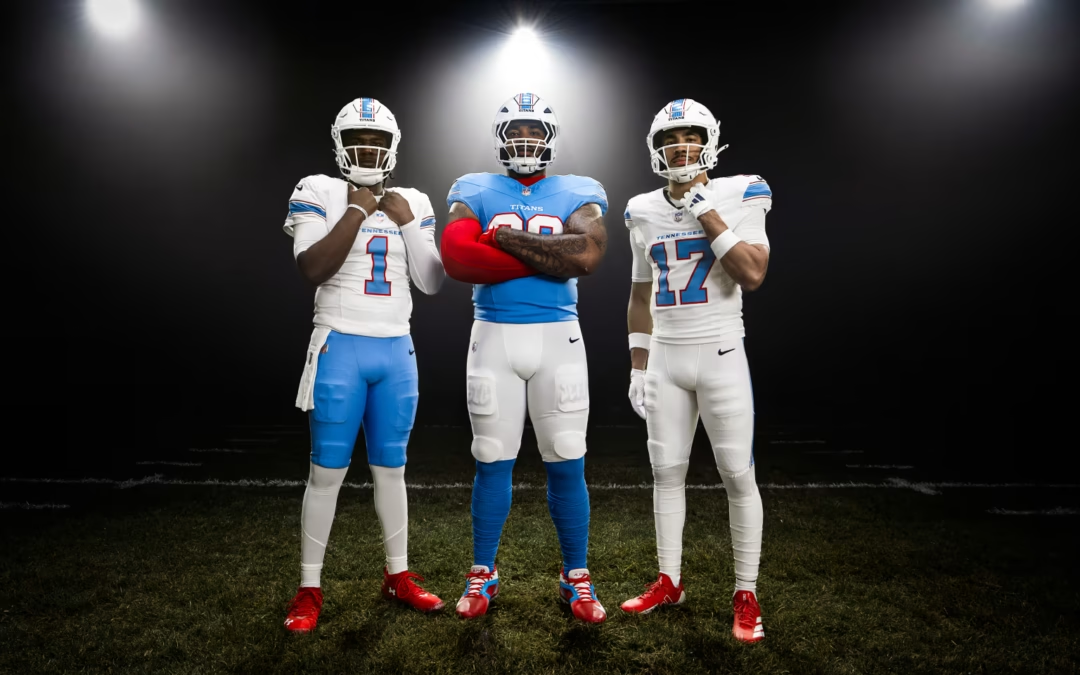
The Tennessee Titans have finally stepped out of one of the most confused uniform eras in the NFL and into something that actually feels cohesive, intentional, and — most importantly — recognizable.
And the reason is simple.
They went back to the Houston Oilers well.
(See what I did there?)
The Return of a Colour System That Actually Works
The powder blue and red combination is one of the best in professional sports. Full stop.
It’s distinctive. It’s legible on broadcast. It doesn’t fall into the endless loop of navy, black, and “safe” modern palettes that have flattened visual identity across the league.

And credit where it’s due — committing to that colour story takes confidence.
In a league where too many teams default to darker, interchangeable tones, this immediately stands out. It feels energetic. It feels nostalgic. It feels right.
A Necessary Correction


Let’s not sugarcoat what came before.
The Titans’ previous uniforms weren’t just dated—they were overdesigned to the point of incoherence. Competing greys, awkward gradients, and a number font that looked like it belonged in a rejected arena football concept. It was visual noise dressed up as innovation.
And the biggest misstep of all:
The navy helmet.
It buried the logo. Removed contrast. Flattened what was once a dynamic mark into something forgettable.
This new set fixes that instantly.
White helmets. Clean presentation. A palette that actually breathes again.
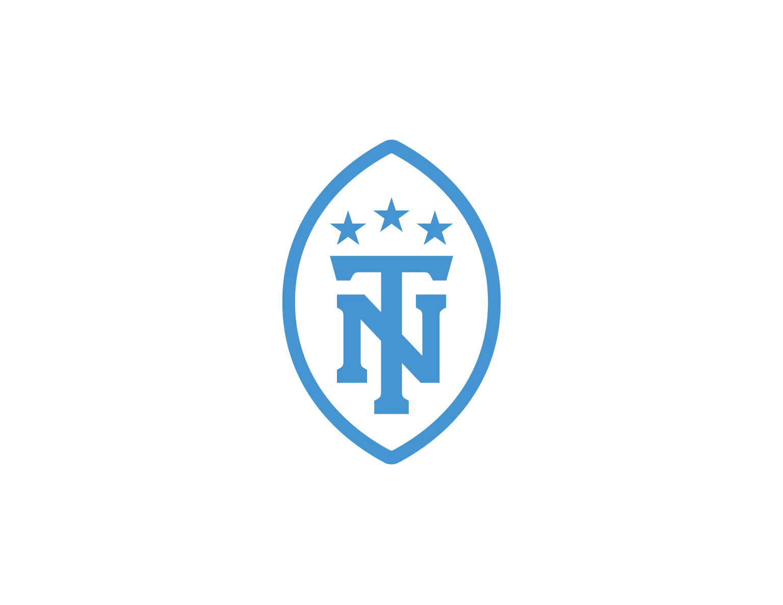
The Logo Shift: Energy vs. Timelessness
The updated mark is… fine.
Cleaner. Simpler. Less mythology, more restraint.

Losing the flame detail removes some of the motion and personality that made the original Titans identity feel alive, especially on helmet applications where directional graphics matter.
But there’s a trade-off here.
This version will age better. It aligns more naturally with the throwback-inspired uniforms. It’s less likely to feel tied to a specific design era.
So while it’s not a home run, it’s a professional, disciplined choice.
The Striping Problem (A Case of Overthinking It)

Here’s where things wobble a bit.
The original Oilers striping worked because of its confidence:
-
Thick, bold colour blocks
-
Clear contrast
-
Instantly readable at a distance
This new version?
It gets… clever.
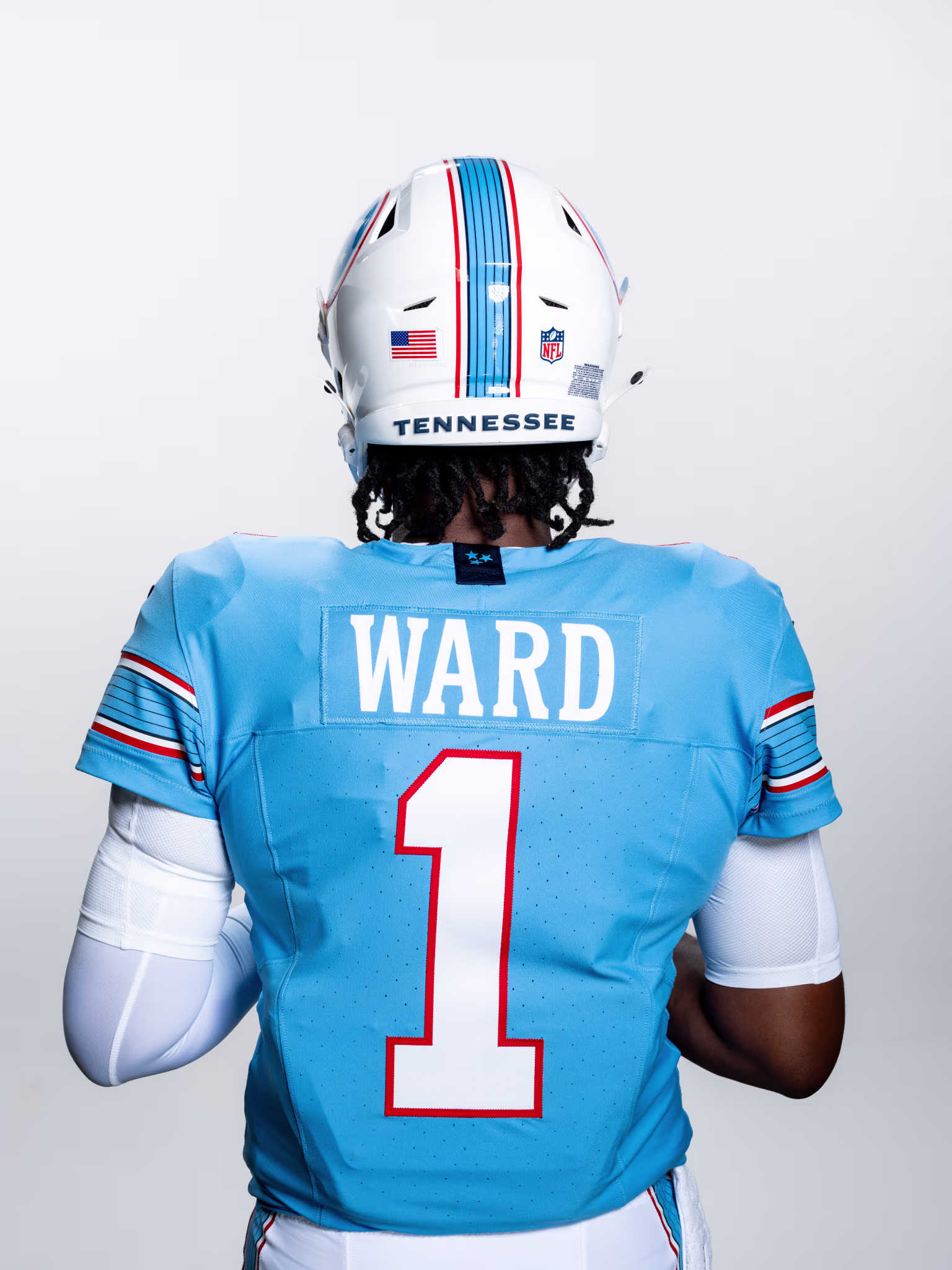
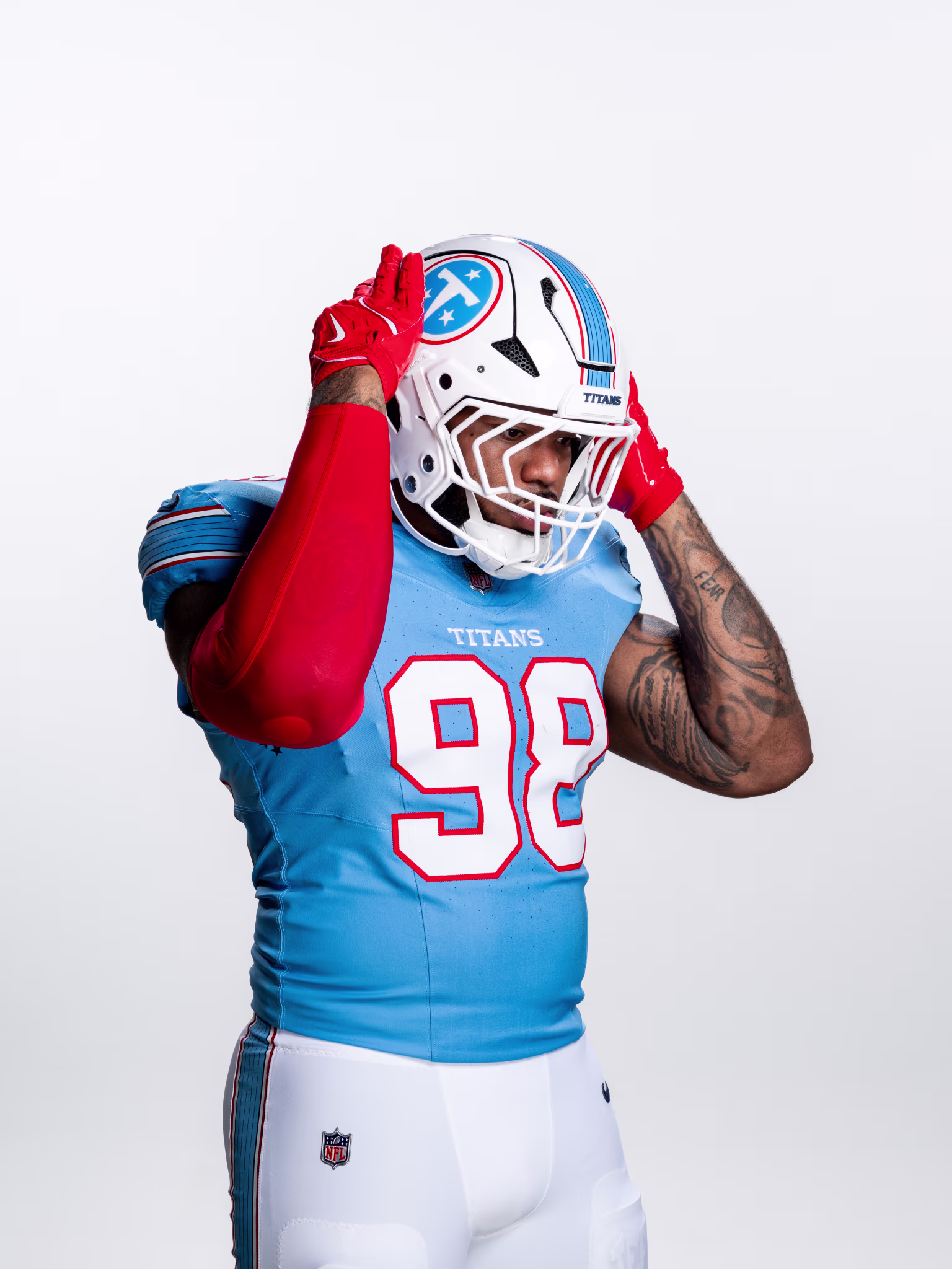
You’ve got thin red and white accents that struggle to show up on screen, plus internal striping meant to evoke guitar strings—a nod to Nashville’s music culture.
It’s a nice idea.
But it’s also unnecessary.
From a distance, it collapses into a single blue stripe anyway. The nuance is lost. And because the Nashville Predators have already explored similar territory, it doesn’t feel particularly ownable.
This is a classic case of designing for the concept, not the camera.
The Helmet Moment
Then there’s the helmet.
And yes… the now-infamous logo orientation issue.
In the official rollout, the stars in the mark were misaligned — a small detail, but one that designers (and fans) immediately clocked.
It’s a reminder that even in major launches, the smallest details carry weight.
The Bigger Tension No One Can Ignore
And now we get to the real conversation.
These uniforms look right.
They just don’t feel right here.
Because if we’re being honest, this identity belongs in Houston.
The Oilers’ visual DNA — this colour palette, this striping logic, this entire aesthetic system — is deeply tied to that city’s football history. Seeing it worn by Tennessee still feels like a relocation story that never fully resolved itself.
If you were redesigning the NFL from scratch?
You’d probably land on something like this:
-
Titans return to their early-2000s identity (which was already a modern classic)
-
Houston Texans evolve — or fully reclaim — the Oilers name and look
And suddenly, everything makes more sense.
As it stands, the Titans now have a strong uniform.
But the league still has a brand alignment problem.

Final Take
This is a clear upgrade. No question.
Cleaner. Bolder. More confident. Finally rooted in something that works.
But it’s also a reminder that great design isn’t just about execution.
It’s about ownership.
And right now, the Titans look better than they have in years…
while wearing a story that still feels like it belongs to someone else.
Grade: B
(If this were Houston? Easy A+.)
Brand systems don’t exist in a vacuum. They carry history, context, and meaning — and the best ones know exactly where they belong. At Orbit, that’s the kind of clarity we build into every brand: aligning design, story, and strategy so everything works together, not against itself. If that’s a conversation you’re exploring, we’re always open.